That title up there, those are Andre’s words, and of course he’s correct. So enough about Andre and on to me.

I showed up to Gazelles class Tuesday for the 1000 meter repeats at Zilker. Managed six somewhere between 3:59 and 3:37, which puts my fitness somewhere around last February levels (and aligns with the 800s from last week which also equated to Feb 07 fitness levels).
Today I showed up for my third Gazelles workout in a row, which goes against all wisdom and experience. Have I learned nothing from the mystic runners? Anyway, it was 7 mile fartlek, which is my longest run in weeks, and which gave me a stitch for the last 3 miles. Fletch and Duane were nice enough to let me keep up, but I’ve noticed on these Gazelle workouts that I feel really awkward, especially as I try to speed up the pace. It’s like my legs forgot how to turnover and my arms forgot how to swing. I feel like an uncoordinated mess out there.
Oh yeah, in lieu of a run on Wednesday I, gasp, rode my bike! Twas such a beautiful day and if I plan on winning the Blanco Mini Outback Triathlon this year (ha!), it seemed like the prudent thing to do. I very much enjoyed it.
None of this is all that interesting or well-written so here’s a bit more on the completely useless 2007 Austin Marathon average pace data from the other day. Andre asked,
so are the averages cumulative or specific to that interval? in other words, when i see “21m split avgâ€, does that mean the pace from mile 0 to mile 21? or the pace from mile 17 to mile 21? if it’s the former, that slow down in the last 5 miles is pretty extreme.
It’s the former, the average pace from mile 0 to mile 21.
While Marc asked,
does the script control for elevation?
Ha ha ha.
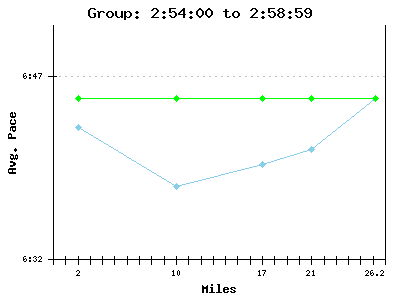
And because I’m a dork, I added graphs to the data. Assuming you’re all too lazy or uninterested to actually click back over to that old post with the graphs, here is a sample. The green line is this group’s average pace (as if it were a baseline) for the marathon, while the blue line is their actual pace for the marathon.

Hmmm… after actually looking at the graphs, many of them appear to be gibberish. This is because one, I’m a moron, and two, the graphing library I used doesn’t handle min:sec time increments so I had to hack it … which leads back to point number one: I’m a moron. Oh well, they look kinda cool.


